How close can you match color?
At PrintDirtCheap.com we aim for a pleasing 95% to 98% color match on Gang Run printing and a 98% to 100% Match on Custom Printed Jobs. In some cases the colors of your jobs may not match the exact colors shown on your screen or the exact color of a previous
order. This shift is due to many different reasons, the most common we will cover below.
PLEASE NOTE: If you need very close or exact color matches we recommend Spot Color Printing, NOT the more economical Gang Run Printing. You may request a custom quote here: Custom Quotes
Gang Run Printing
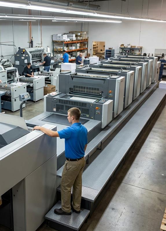
Unless stated otherwise, we use a process called Gang Run Printing in which we combine multiple jobs to print on the same sheet. This process helps to significantly reduce prices by dividing the production costs across several jobs. Full color cards no
longer need to cost hundreds of dollars a set. The downside is that by going from product to product, the colors may shift depending on the designs next to it.

The two main goals in gang run printing are substantial cost savings and pleasant color matching. Our press operators balance the colors on all jobs so everyone has a 95%-98% color consistency. Below you can see the results of having all dark cards on
a run versus having light cards. The dark cards may darken your card's image slightly whereas the light images may lighten the image. As you will see in the example of the Realtor's card below, the skin tone as well as the blue may shift from
run to run.
Dark Card Example printed in January

Lighter Card Example printed in July

Since the ganging of jobs is an automated process we cannot change the card order for special requests. If colormatching is critical to your order, we do not recommend gang run printing. A custom run of only your order will give our press operators the
control needed to match your colors exactly. You may request a custom quote here: Request a Quote
Color Mode: We use CMYK inks for printing, so if your design is in RGB mode, the colors will shift. For more detailed information about RGB color modes and how they affect your design, click here.

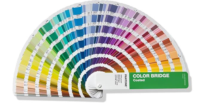
Pantone or "Spot Colors": Your file may contain Pantone, or Spot Colors that are not intended for four color process printing. You can see in the image below that many Pantoe Colors do not have an exact CMYK match. We recommend using
a Pantone Color Bridge (available by clicking here) to ensure you are aware of the color variances. You can read more about Pantone Color issues, click here.

Papers and Inks: Papers and inks are not all created equal. Printing methods also vary from offset to digital. Over time, the brand of paper and of inks we use may change. If you print a product with us and months later you ask for a
reprint, the change of brands can cause a slight shift in colors. Other factors affecting this are the humidity in the air and the temperature which can affect the way the inks dry and how they look after. There's no way to match a print
made at Company X that uses 92 bright white paper and Company Y that uses 96 bright white paper.


Color IS in the Eye of the Beholder: Everyone perceives colors in a different way. Adding to that, there is a large percentage of people with some color-perceiving condition. This means that even if the colors stay the
same or change in just the slightest way, you may still see them differently than someone else.

Tips for a more accurate color matching
- Make sure your design is in CMYK mode.
- Order a printed proof so you can see what your job looks like printed on a calibrated machine. Monitors and office inkjet machines are not calibrated and cannot give a good representation of color for commercial printing.
- You can ask for a quote for your product to be printed on a Custom Run, on its own sheet of paper, although that comes with an increased price since you’re not sharing the production costs with other people.
- Use the Pantone Color Matching System - Color Bridge, which is a standardized catalog of colors that you can achieve using CMYK that is available from Amazon in the link below:
 Pantone Color Bridge Guide Coated - CLICK HERE
