Your logo is a part of your brand but your brand isn’t just your logo. Your brand is every interaction the client has with your company, from your parking lot to the music a client hears while on hold even to how neat the bathrooms are and everything in between, all this is a part of your brand, how crazy is that!? Who would have thought that keeping up the maintenance in your bathroom was the make it or break it point?
So, where does the logo come into play with your brand? Well, it literally shows up everywhere (if it doesn’t, you’re doing it wrong), on your website, business cards, letterheads, advertisements, you name it! A logo is like the cover to a book, if it catches your attention enough you’ll read it, just like a book cover a logo should catch enough attention to draw potential customers in. It is a suggestion, a clue so it can work in conjunction with your name to make your brand unique and memorable.
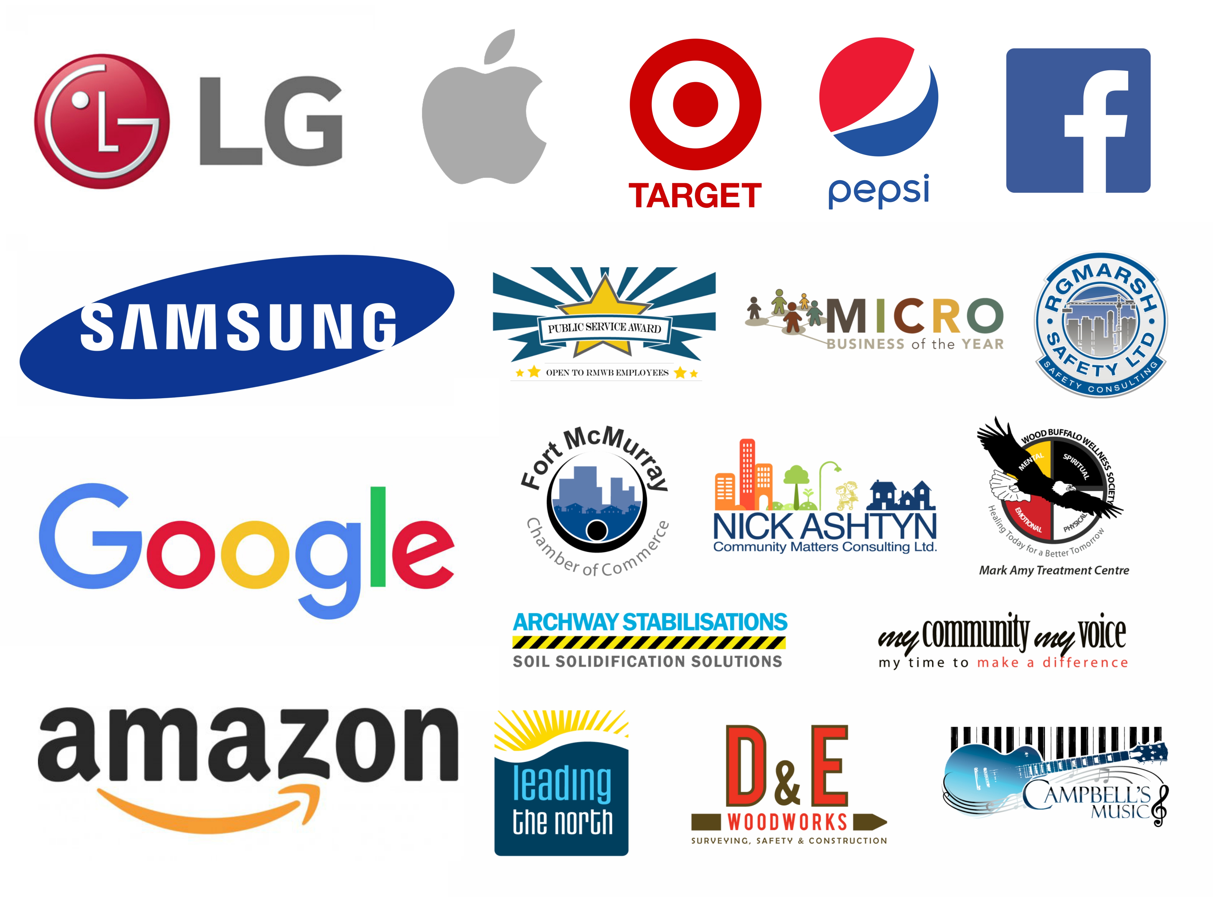
*Notice anything about these logos? Some of the biggest companies have the simplest designs.
4 Rules of logo design
1.Know your brand
You should know something about your brand first. You need to know who your clients are, what you want from them, and what they want or expect of your company. No one knows your brand like your team, they are the brand, so consult them because like we mentioned before brand is every interaction a client has with your company and your team is at the forefront.
2.Simplify
Less is more! If your main goal is to look provincial then by all means slap on another color or two and add some more fonts. If that’s not your goal then remember a little can go a long way so avoid using too many lines, shapes, colors and fonts on your logo.
3.Aim high
When designing your logo, it should be as strong, or stronger, than the big brand competitors, but don’t worry too much about what all your little competitors are doing around you, shoot for the stars and choose your logo for the multi-billion-dollar capitalist success story you know you are!
4.It’s impossible to make everyone happy
It will happen, someone isn’t going to be happy with the choices you’ll make when choosing your logo. You’ll have each team member wanting a different color or font and next thing you know, you have a mess. Rather than settling on a color or font, ask your team what feelings they want to convey with the logo. Do we want to seem techy or trendy? Do we want to convey a feeling of warmth and optimism? Once you know all that you’ll be able to create your very own logo. Not everyone will be happy in the end but at the very least they will understand your choices.
IS YOUR LOGO UP TO DATE?
Your company brand might be the best in the area, but if your logo isn’t the real thing customers won’t feel attracted to your company. To reach many customers, a great logo design is essential so try testing your logo with the questions below!
ADD ONE POINT FOR EACH “YES” BELOW (Start at 0 and keep track)
Is your logo in landscape(horizontal) format?
Is your logo a chameleon i.e. can you adjust it to fit any format?
Can you make your logo work in Black and White?
Can you slap your logo on a Black or White background without adding a box around it?
Can you draw all non-typography elements in five seconds or less?
Did you buy or create the font you used in the logo?
Do you use less than two fonts?
SUBTRACT ONE POINT FOR EACH “YES” BELOW (Hope you kept track)
Does your logo have more than two colors in it?
Do you have more than one shape, not including text, in your logo?
Are there any explicit or abstract shapes in your logo? (i.e. a globe or a square)
Do you use any free clip art in your logo?
Is there a photo or complex pattern in your logo?
Do you have a gradient in your logo?
Did you use default font kerning (Space between characters)?
LET’S SEE HOW YOU DID!
< 0 points – Good Job! …Not really, give it another try.
1- 4 points – If your company is earning millions a year it’s great.
5+ – It’s a masterpiece, well done!

